All of the Swatches
This past week has been the week of swatching. I want to start a new rayon shadow weave shawl. I love the light-colored neutral shawl I made at the beginning of the year, and want something similar with a bit more depth of color.

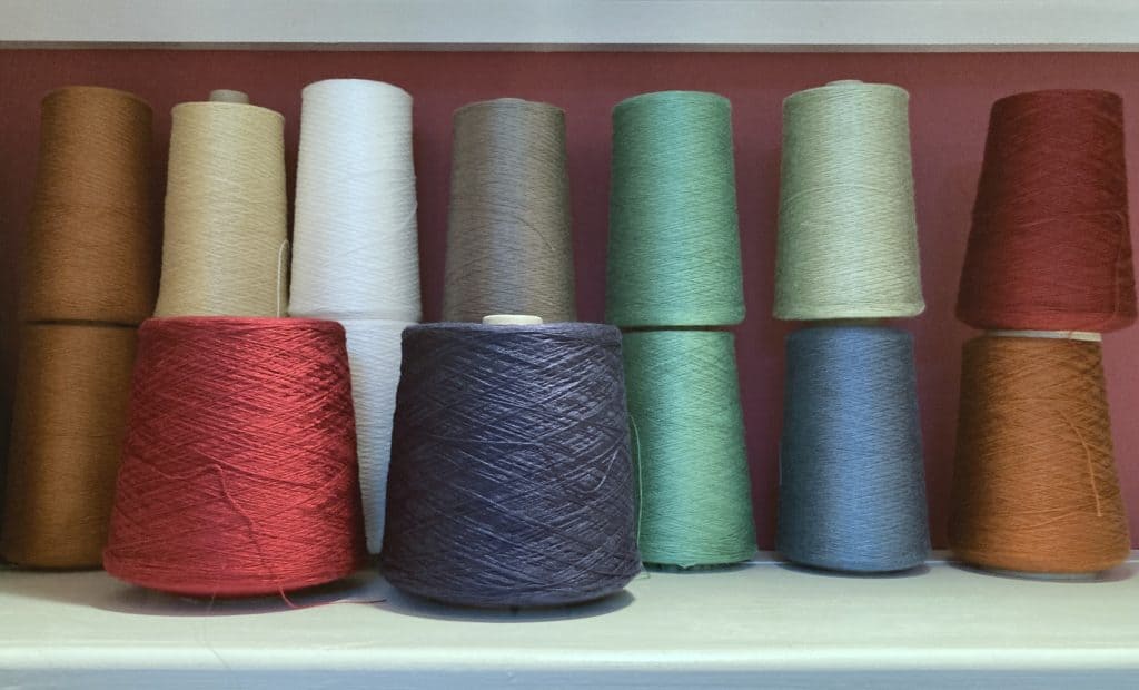
I have a shelf of 8/2 Rayon in my stash, and want to work from stash. This is what I’ve got to choose from:
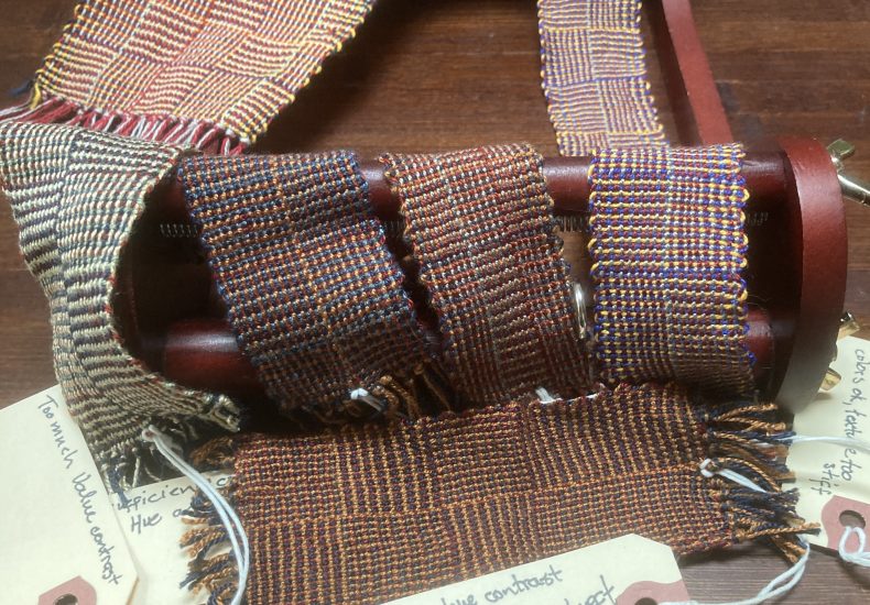
I want to work with the large cones of red and blue for the darks, so I swatched a sample in log cabin to test colors for optical blending, and for appropriate contrast to make the shadow weave illusion work without punching you in the face. And swatched some more. And some more.
This is the swatch series, with the first woven on the left and the most recent on the right:
Some of them were woven on a little beading loom. Some were woven on my inkle and tablet looms. I’m trying to figure out the most efficient way to do a color swatch, both in terms of time to set up/weave off and in terms of yarn waste. So far the beading loom with a string heddle is what is working best for me.
Swatches like this are essential with four-color shadow weave. It’s just not possible to predict what the optical blending effect will be, and it’s frustrating to put something on the loom that ends up looking like hot garbage. It’s also hard to predict how effective the shadow weave illusion will be.
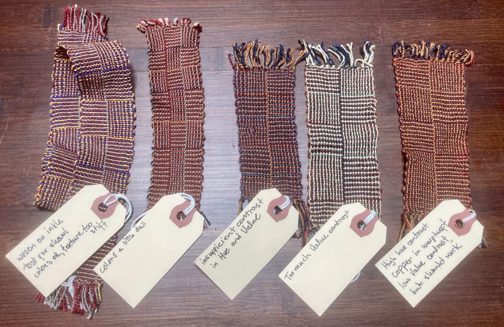
I best like the color combination of the middle one, but the shadow weave illusion is almost completely absent. This is because the Light color I’m using in the weft is a copper that is too similar in Hue to the Dark red I’m using in the warp. The two colors merge into a coppery-red line that crosses the shadow weave illusion lines, and breaks it up.
The swatch on the right is where I ended up. I decided I don’t have two Lights that work well with the red and blue Darks, so I’m using the same copper color as in the middle swatch, but in both warp and weft. Since both Lights are the same color, the red+copper lines seen in the center swatch don’t appear here, only clean copper lines.
I’m also swatching for my Curry for Dinner placemats that are planned as a pattern for my upcoming shadow weave book:
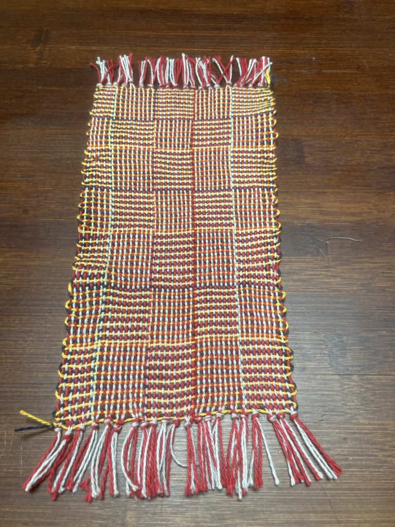
I was worried that the three saturated primary colors + white would be too individually strong to optically blend well, but I’m pleased with the result. I’m looking forward to seeing them in the pattern I’ve designed.
Sooo… sneak previews of my next two designs. I also have a Powell pattern gamp on the loom:

Leave a Reply